In today’s digital world, your website is often the first impression customers have of your business. A well-designed, optimized website can act as a 24/7 sales machine, but a poorly maintained one? It can drive away potential customers before you even have a chance to make a sale.
Even if you’ve got great products or services, the wrong choices with your website can severely impact your success. Let’s take a look at five common website mistakes that hurt your business—and how to fix them!
1. Slow Loading Speeds
We live in a fast-paced world, and the internet is no exception. Studies show that 40% of visitors will leave a site if it takes more than 3 seconds to load. Imagine losing nearly half of your traffic just because your site’s too slow! But speed isn’t just about user experience. It also affects your SEO ranking; Google favors fast websites.
The Fix:
- Optimize Images: Use compressed images to reduce file size. Tools like TinyPNG can help without sacrificing image quality.
- Use a Content Delivery Network (CDN): A CDN distributes your site’s content across multiple servers worldwide, helping users load your site faster no matter where they are.
- Leverage Caching: By enabling caching, you allow repeat visitors to load your site faster.
- Upgrade Your Hosting: If you’re on a shared hosting plan that’s struggling with traffic, it might be time to upgrade to a VPS or dedicated hosting solution from NodeSpace.

2. Lack of Mobile Optimization
With more than half of web traffic coming from mobile devices, a non-optimized mobile experience is a deal-breaker. If your site looks like a miniature version of your desktop page when accessed on a phone, you’re alienating a huge chunk of users.
The Fix:
- Choose a Responsive Design: Most modern website builders like WordPress offer responsive templates that automatically adjust based on screen size.
- Test Your Site on Multiple Devices: Use tools like Google’s Mobile-Friendly Test to ensure your site performs well on smartphones and tablets.
- Simplify Navigation: On mobile, less is more. Ensure your menu is easy to access and doesn’t overwhelm the user.

3. Poor Call to Action (CTA)
What do you want visitors to do when they land on your site? Whether it’s signing up for a newsletter, purchasing a product, or contacting you, a clear and compelling call-to-action is essential. The absence of strong CTAs, or worse, too many vague ones, confuses visitors and reduces conversions.
The Fix:
- Use Clear Language: CTAs should be direct, like “Sign Up Now” or “Get Started Today.” Avoid overly complicated phrases.
- Make It Stand Out: Use contrasting colors and bold fonts to make your CTA buttons or links stand out on the page.
- Place CTAs Strategically: Include a CTA above the fold (before users scroll) and sprinkle them throughout your site, particularly on landing pages.

4. Ignoring SEO Best Practice
Your website might look fantastic, but if no one can find it, all your hard work is for nothing. Search Engine Optimization (SEO) is how search engines like Google rank your site and decide whether to show it to potential customers. Without SEO, your site might as well be invisible.
The Fix:
- Use Relevant Keywords: Conduct keyword research to identify the terms your audience is searching for, and strategically use them in your content.
- Optimize Meta Tags: Title tags and meta descriptions should be optimized for SEO with your primary keywords.
- Build Internal Links: Linking to other pages on your site helps Google understand the structure and importance of your content.
- Regularly Publish Quality Content: Fresh, informative content signals to search engines that your site is active and relevant.

5. No Clear Contact Information
A common mistake many businesses make is hiding their contact details or, worse, not including them at all! Imagine someone loving what you offer but giving up because they couldn’t find a way to reach out. That’s a lost sale right there.
The Fix:
- Add a Dedicated Contact Page: Make it easy for visitors to get in touch by including a well-organized contact page with all relevant information (email, phone number, physical address, etc.).
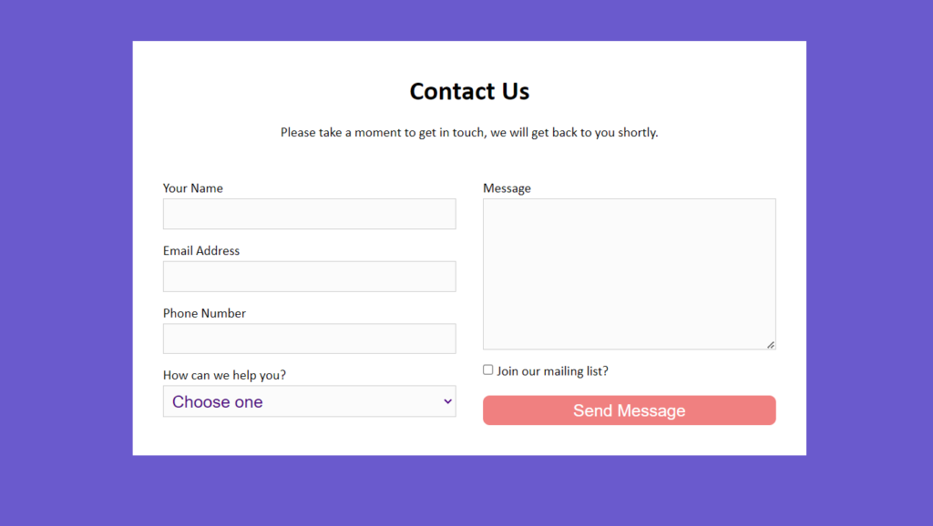
- Use a Contact Form: Provide a simple contact form for users who prefer reaching out digitally without leaving your site.
- Place Contact Info in the Footer: Even if visitors don’t go to the contact page, they should be able to find your information in the footer of every page.

Wrapping It Up
Mistakes on your website don’t just lead to a frustrating experience for your users—they can hurt your business and drive away potential sales. The good news? All these mistakes are easily fixable! By optimizing your site speed, ensuring mobile-friendliness, improving your CTAs, following SEO best practices, and making your contact info easy to find, you can create a website that supports your business goals rather than hinders them.
Need help making these changes? At NodeSpace, we offer hosting solutions that keep your website running fast and efficiently. We also provide customer support to guide you through the technical stuff, so you can focus on what matters—growing your business.
Ready to take your website to the next level? Start with reliable, secure hosting from NodeSpace!


Hey people!!!
HAVE A NICE DAY